自动摘要
正在生成中……
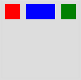
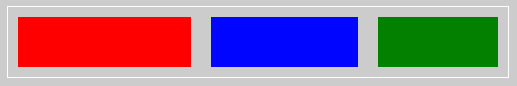
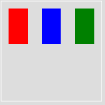
flex-basis
更改主轴(main axis)的预设属性值,现在主轴是水平的,位于主轴上的属性是width。如下范例中,flex-basis会将红色、绿色方块的宽度设为50px,而蓝色方块的宽度设为100px。
<div class="container">
  <div class="item red"></div>
  <div class="item blue"></div>
  <div class="item green"></div>
</div>
.container {
  display: flex;
}

.item {
  flex-basis: 50px;
  height: 50px;
  margin: 10px;

  &.red {
    background: red;
  }

  &.blue {
    background: blue;
    flex-basis: 100px;
  }

  &.green {
    background: green;
  }
}
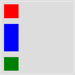
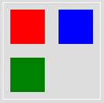
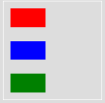
假设使用flex-direction: column让主轴旋转为直向,使方块垂直排列呢?位于水平轴(main axis)上的属性就是height,会被更动到的属性是方块的高度。
.container {
  display: flex;
  flex-direction: column;
}

.item {
  flex-basis: 50px;
  width: 50px;
  margin: 10px;

  &.red {
    background: red;
  }

  &.blue {
    background: blue;
    flex-basis: 100px;
  }

  &.green {
    background: green;
  }
}
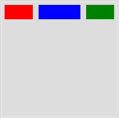
flex-grow
每个区块(这里是指小方块)可在主轴上占容器的多少部份,或说是如何分配剩余空间,可参考- flex-grow的计算方式。
例如:每个小方块预设是占1 份,但是蓝色小方块可占2 份。
.container {
  display: flex;
}

.item {
  height: 50px;
  margin: 10px;
  flex-grow: 1;

  &.red {
    background: red;
  }

  &.blue {
    background: blue;
    flex-grow: 2;
  }

  &.green {
    background: green;
  }
}
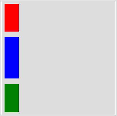
若更改主轴方向为直向,则会是这样
.container {
  display: flex;
  flex-direction: column;
  height: 500px;
}

.item {
  width: 50px;
  margin: 10px;
  flex-grow: 1;

  &.red {
    background: red;
  }

  &.blue {
    background: blue;
    flex-grow: 2;
  }

  &.green {
    background: green;
  }
}
flex-shrink
与flex-grow 相反,flex-grow 是膨胀,flex-shrink 是缩小,但说缩小也太笼统了, 应该是如何在空间不够的状态下,依比例缩小以适应有限空间?
如下图,三个小方块的宽度本来皆为200px且左右各有10px的margin,因此总宽200px * 3 + 10px * 2 * 3= 660px超过container的500px,因此红蓝绿三小方块依flex-shrink的设定,分别应缩小1、 2、3倍。
- 超过的宽度为660px - 500px = 160px
- 红色小方块的新的宽度为200px - (1 / (1 + 2 + 3) * 160px)= 173.3px
- 蓝色小方块的新的宽度为200px - (2 / (1 + 2 + 3) * 160px)= 146.6px
- 绿色小方块的新的宽度为200px - (3 / (1 + 2 + 3) * 160px)= 119px
注意,若比例是用小数点且总和小于1,则又是另一个算法了。可参考- flex-shrink的计算方式。
.container {
  display: flex;
  width: 500px;
}

.item {
  width: 200px;
  height: 50px;
  margin: 10px;

  &.red {
    background: red;
    flex-shrink: 1;
  }

  &.blue {
    background: blue;
    flex-shrink: 2;
  }

  &.green {
    background: green;
    flex-shrink: 3;
  }
}
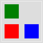
flex-wrap
设定小方块是要强制排成一列或依照容器的包围而排成多列。
wrap
小方块依照容器的大小分列排列,在这里分为2 列。
.container {
  display: flex;
  flex-wrap: wrap;
  border: 1px solid #fff;
  width: 140px;
  height: 140px;
}

.item {
  width: 50px;
  height: 50px;
  margin: 10px;

  &.red {
    background: red;
  }

  &.blue {
    background: blue;
  }

  &.green {
    background: green;
  }
}
wrap-reverse
概念同wrap,只是顺序相反。
.container {
  display: flex;
  flex-wrap: wrap-reverse;
  border: 1px solid #fff;
  width: 140px;
  height: 140px;
}
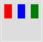
nowrap
小方块排成一列不折行,可使用flex-direction调整主轴方向,即小方块对齐的方向。
.container {
  display: flex;
  flex-wrap: nowrap;
  border: 1px solid #fff;
  width: 140px;
  height: 140px;
}
row
主轴为水平向。
.container {
  display: flex;
  flex-wrap: nowrap;
  border: 1px solid #fff;
  width: 140px;
  height: 140px;
  flex-direction: row;
}
column
主轴为垂直方向。
.container {
  display: flex;
  flex-wrap: nowrap;
  border: 1px solid #fff;
  width: 140px;
  height: 140px;
  flex-direction: column;
}
flex
以上flex 属性的综合设定,意即:
flex: flex-grow flex-shrink flex-basis;
其中,预设值分别是flex-grow: 0、flex-shrink: 1、flex-basis: auto。
因此flex-shrink 的范例就可改写为
.container {
  display: flex;
  width: 500px;
}

.item {
  height: 50px;
  margin: 10px;
  flex: 0 1 200px;

  &.red {
    background: red;
  }

  &.blue {
    background: blue;
    flex: 0 2 200px;
  }

  &.green {
    background: green;
    flex: 0 3 200px;
  }
}
相关阅读- 图解Flexbox基本属性
推荐阅读/ 参考资料