自动摘要
正在生成中……
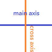
主轴和交叉轴
flexbox 基本上都是靠主轴(main axis) 和交叉轴(cross axis) 运作的。
display: flex
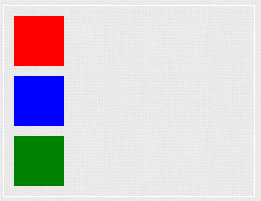
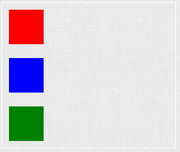
block element 的display 值预设为block,因此三个小方块-红、蓝、绿皆呈现一直行排三列状态。
<div class="container">
  <div class="item red"></div>
  <div class="item blue"></div>
  <div class="item green"></div>
</div>
.container {
  display: block;
}

.item {
  width: 50px;
  height: 50px;
  margin: 10px;

  &.red {
    background: red;
  }
  &.blue {
    background: blue;
  }
  &.green {
    background: green;
  }
}
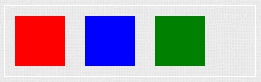
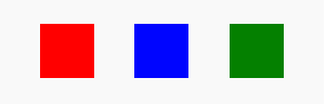
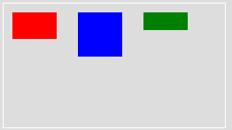
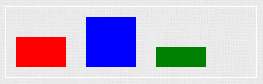
若将父元素container改为display: flex,则会呈现一横列状态。
.container {
  display: flex;
}
flex-direction
设定主轴(main axis) 的方向,可让主轴旋转。
row
主轴为横向。
.container {
  display: flex;
  flex-direction: row;
}
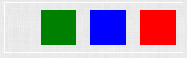
row-reverse
主轴为横向,但反序排列。
.container {
  display: flex;
  flex-direction: row-reverse;
}
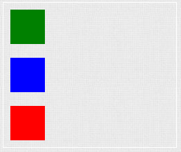
column
主轴为直向。
.container {
  display: flex;
  flex-direction: column;
}
column-reverse
主轴为直向,但反序排列。
.container {
  display: flex;
  flex-direction: column-reverse;
}
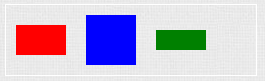
justify-content
主轴的对齐方式,共有6 种选项
- flex-start
- flex-end
- center
- space-between
- space-around
- space-evenly
flex-start
靠左对齐。
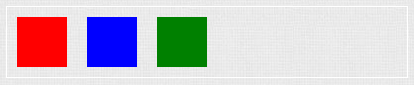
.container {
  display: flex;
  justify-content: flex-start;
}
flex-end
靠右对齐。
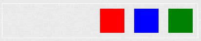
.container {
  display: flex;
  justify-content: flex-end;
}
center
置中对齐。
.container {
  display: flex;
  justify-content: center;
}
space-between
.container {
  display: flex;
  justify-content: space-between;
}
space-around
.container {
  display: flex;
  justify-content: space-around;
}
space-evenly
.container {
  display: flex;
  justify-content: space-evenly;
}
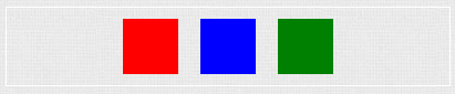
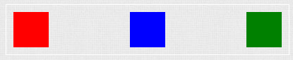
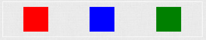
space-between vs space-around vs space-evenly
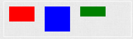
- space-between:每个小方块拥有相同的间隔,但与父容器之间没有间隔。这里会有10px 的空隙是因为我将每个方块预设有10px 的margin 的缘故。
- space-around:每个小方块之间与父容器有间隔,但小方块与父容器之间的间隔是小方块彼此间隔的一半。
- space-evenly:每个小方块之间和与父容器之间拥有相同的间隔。
align-items
交叉轴(cross axis) 的对齐方式,共有5 种选项
- flex-start
- flex-end
- stretch
- baseline
- center
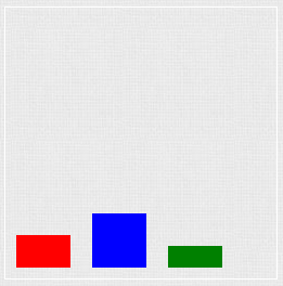
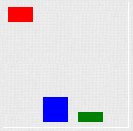
flex-start
若小方块不等高,则会依容器的顶端对齐。
过去在没有flex的世界里,若希望小方块向上对齐会使用vertical-align: top。
.container {
  width: 250px;
  height: 140px;
}

.item {
  width: 50px;
  margin: 10px;
  display: inline-block;
  vertical-align: top;

  &.red {
    background: red;
    height: 30px;
  }

  &.blue {
    background: blue;
    height: 50px;
  }

  &.green {
    background: green;
    height: 20px;
  }
}
现在就可以改用align-items: flex-start了。
.container {
  display: flex;
  align-items: flex-start;
}

.item {
  width: 50px;
  margin: 10px;
}

.red {
  background: red;
  height: 30px;
}

.blue {
  background: blue;
  height: 50px;
}

.green {
  background: green;
  height: 20px;
}
flex-end
若小方块不等高,则会依容器底部对齐,类似过去使用的vertical-align: bottom。
.container {
  display: flex;
  align-items: flex-end;
}

.item {
  width: 50px;
  margin: 10px;
}

.red {
  background: red;
  height: 30px;
}

.blue {
  background: blue;
  height: 50px;
}

.green {
  background: green;
  height: 20px;
}
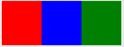
stretch
小方块不设定宽、高、间距,充满整个容器。
.container {
  display: flex;
  align-items: stretch;
}

.item {
  flex: 1;
}
baseline
若小方块不等高,则会依容器的基准线对齐,类似过去使用的vertical-align: baseline。
.container {
  display: flex;
  align-items: baseline;
}

.item {
  width: 50px;
  margin: 10px;
}

.red {
  background: red;
  height: 30px;
}

.blue {
  background: blue;
  height: 50px;
}

.green {
  background: green;
  height: 20px;
}
center
若小方块不等高,则会依容器的中线对齐,类似过去使用的vertical-align: middle。
.container {
  display: flex;
  align-items: center;
}

.item {
  width: 50px;
  margin: 10px;
}

.red {
  background: red;
  height: 30px;
}

.blue {
  background: blue;
  height: 50px;
}

.green {
  background: green;
  height: 20px;
}
备注:align-itemsIE只支援11 (含)以上。
align-self
设定单一元素的对齐方式,会覆写父层align-items的设定。
.container {
  display: flex;
  align-items: flex-end;
}

.item {
  width: 50px;
  margin: 10px;
}

.red {
  background: red;
  height: 30px;
  align-self: flex-start;
}

.blue {
  background: blue;
  height: 50px;
}

.green {
  background: green;
  height: 20px;
}
相关阅读:图解Flexbox进阶属性
推荐阅读/ 参考资料